A good poster can make or break someone checking out a new movie. In fact, I often find myself trying out new movies based on how their posters grab me. Every year, I try and honor the best poster designs in horror: separating the boring, actor headshots from the truly artistic pieces of work. This year had a slew of great poster designs that deserve recognition for how they sell their film. Below is a selection of my top posters of the year in no particular order.
The Best Horror Posters of 2022
Ultrasound
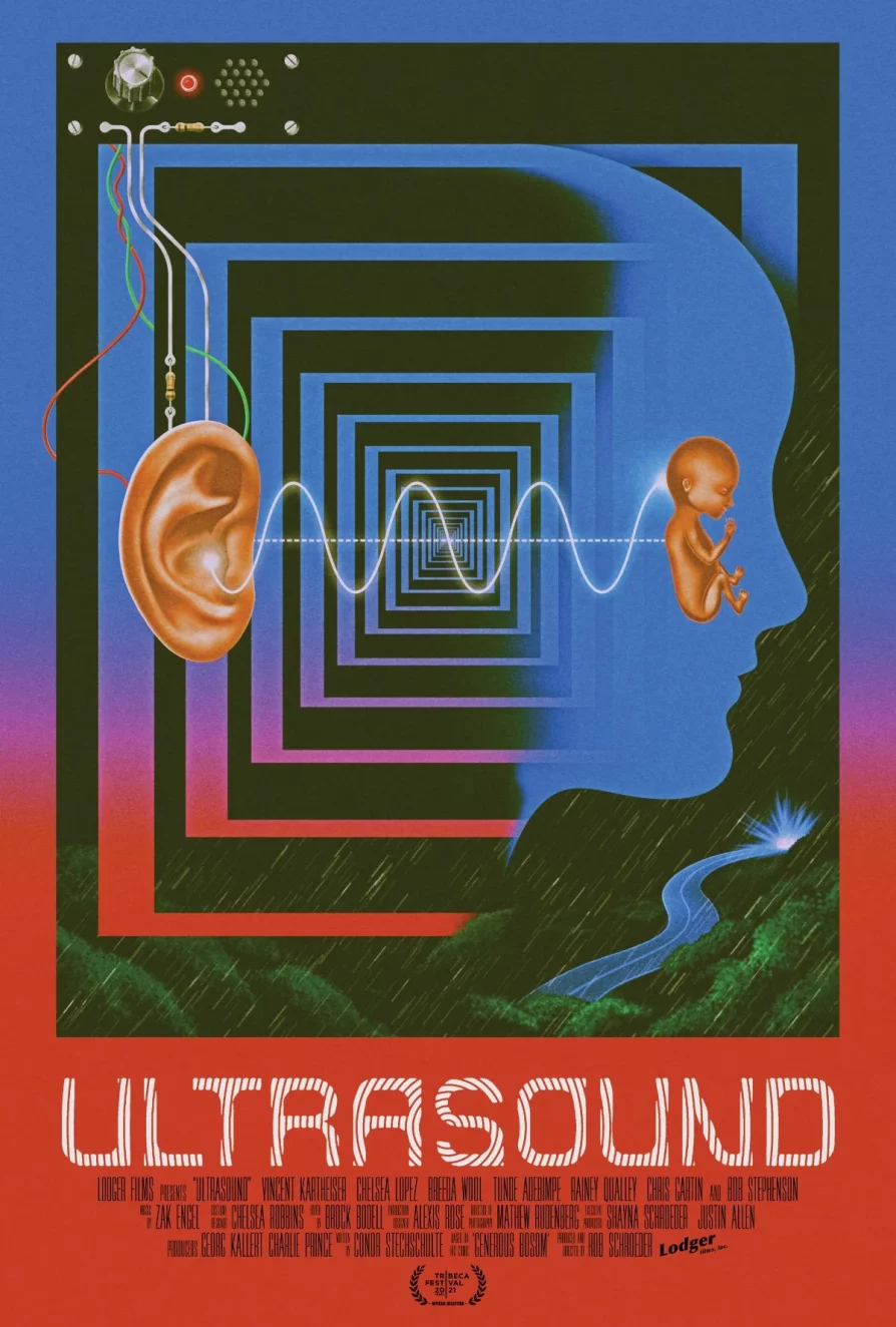
Perhaps one of the cooler posters I’ve seen in awhile, there’s a lot to catch the eye in this colorful, retro artwork. From the color palette to the muted tones recalling 90s computer technology, this poster looks great. The simple shapes catch the eye as well as the facial illusion, and the closer you look the more interesting gems stand out. Not to mention the hypnotic font for the title.
Ultrasound is a psychological dark sci-fi film that works better the less you know going in, so this poster works well to intrigue the viewer while not revealing almost anything of the plot of the film. If I didn’t make it clear, I love this poster.
X
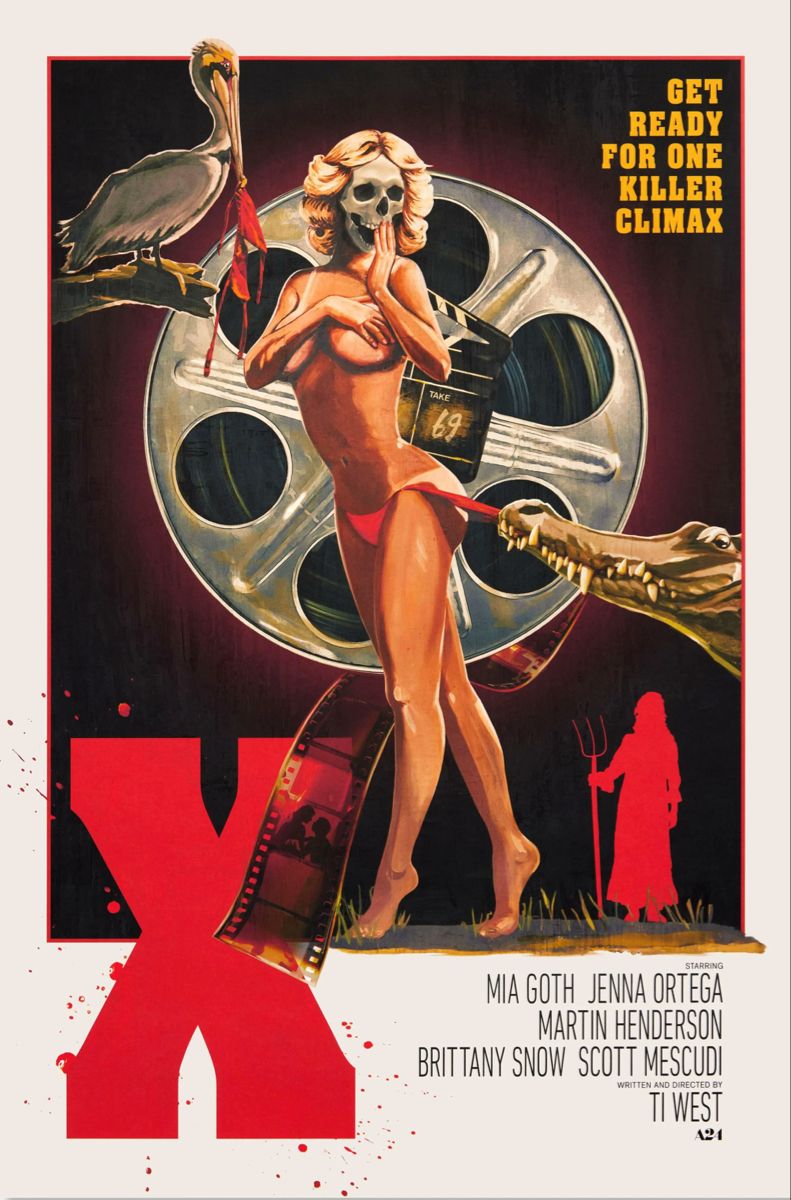
A lot of the X posters I was not fond of, but this one stood out to me as a homage to the 1970s grindhouse films that this movie is riffing. The subject is strikingly centered over a circular film cannister that works as a background and nod to the filmmaking subject. It also features my favorite character, the gator, getting up to some scandalous hijinks which is always fun.
Watcher
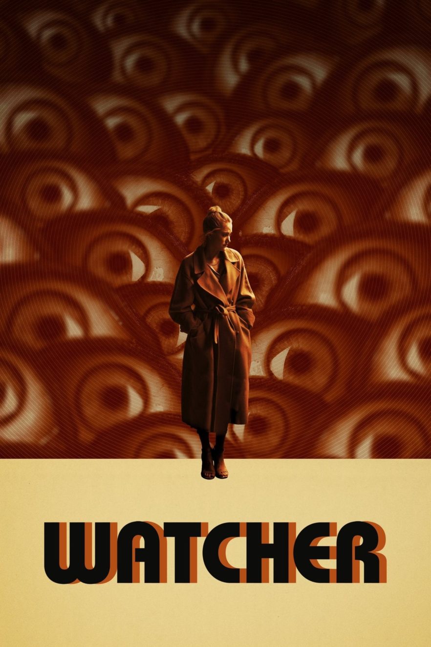
Watcher is a fun little film centering on the iconic Maika Monroe, and this poster knows that it’s all eyes on her. I love the minimal color usage which creates contrast and the collage look to the poster. It’s muted but still fills the space with a fun pattern. It also goes well for the subject matter, as the film is about people watching Monroe’s character, and of course alludes to the title Watcher.
Nope
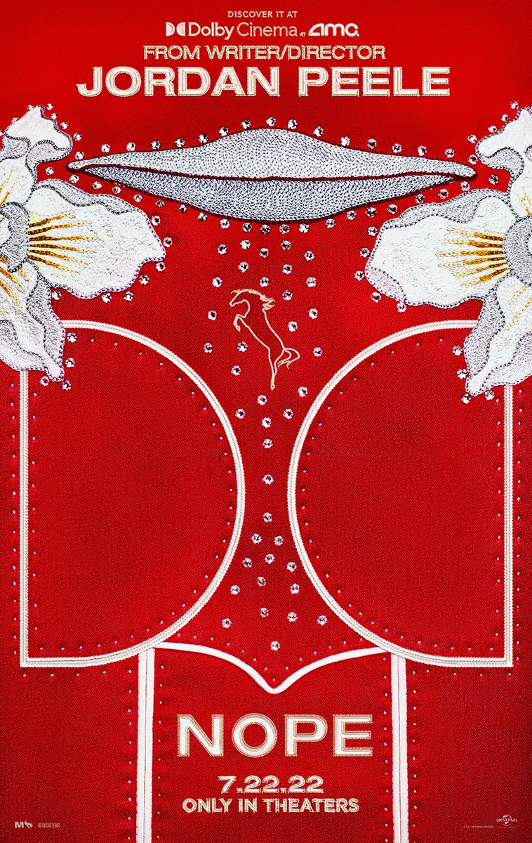
While I was not fond of any of the other Nope posters, this one is a fantastic, bold choice. The poster doesn’t feature any humans, but gives good, non-spoilery imagery from the movie in a non-traditional way. At first looking like an abstract design, the poster takes the design on Steven Yeun’s character’s audacious red suit and combines it with eyecatching rhinestones that all together are styled to show a scene from the film, a UFO abducting a horse.
Resurrection
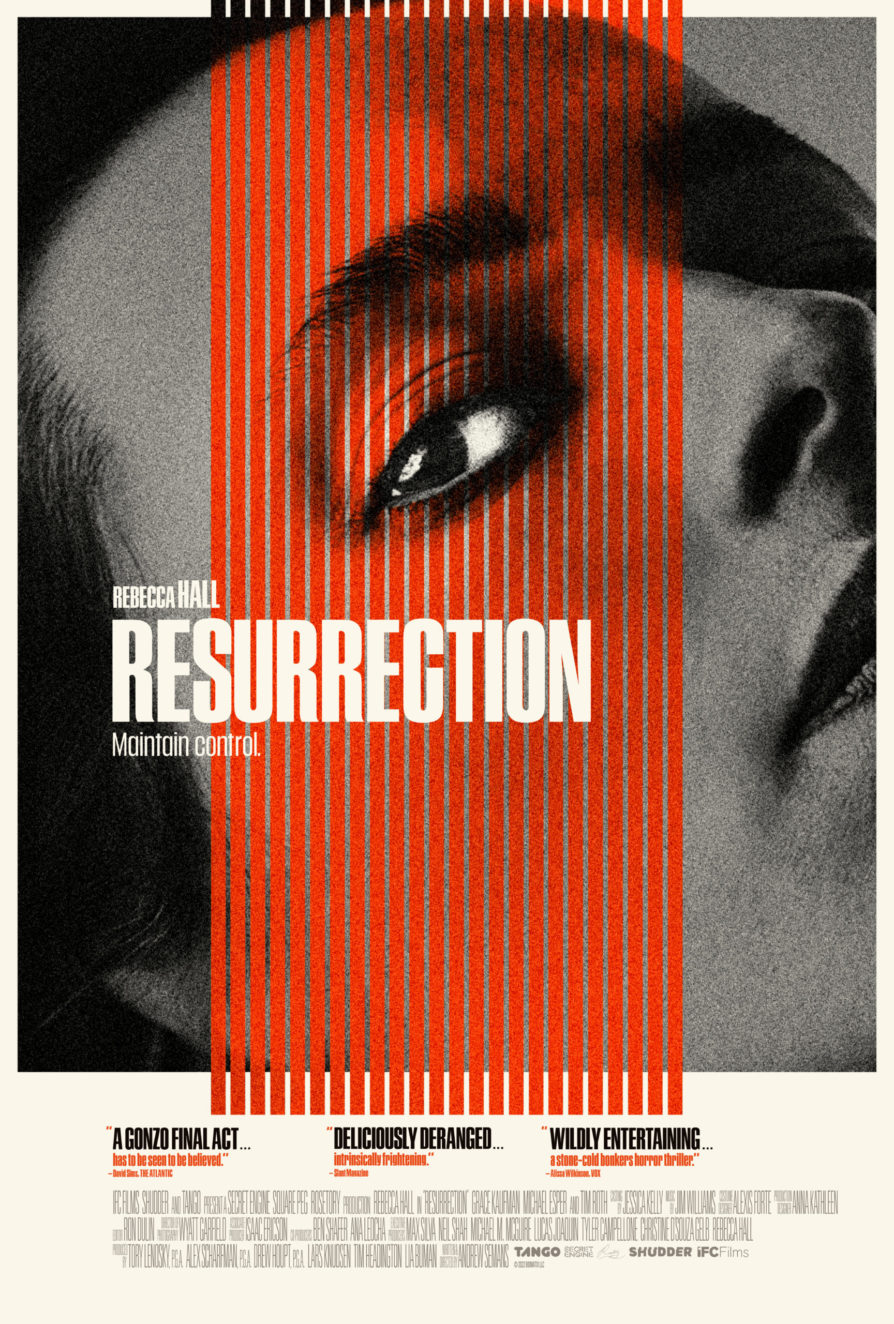
This poster literally catches the eye, in more ways than one. This is one of the few “big head” posters I enjoy as it adds in design elements that make it more visually interesting. It stays simplistic with a large black and white image of Rebecca Hall’s grim face, and then ties it all together with the centered red lines framing her emotionless eye.
Barbarian
Barbarian had a number of cool posters that deserve recognition. Almost all of them use a red and black color scheme with heavy contrast. The first one featuring the large face resembles classic 1980s horror film posters with an almost painted-looking horrified face and a stylized font. I also love how the font create a layer of perspective for the camera, adding another interesting element to the poster. The second one, I love the simple look featuring the title that also doubles as a tunnel, alluding to themes in the film. The last one I also think makes a big use of a minimal design, and makes use of its red in a fantastic way. The door also makes for a great set piece in the poster.
Hellbender
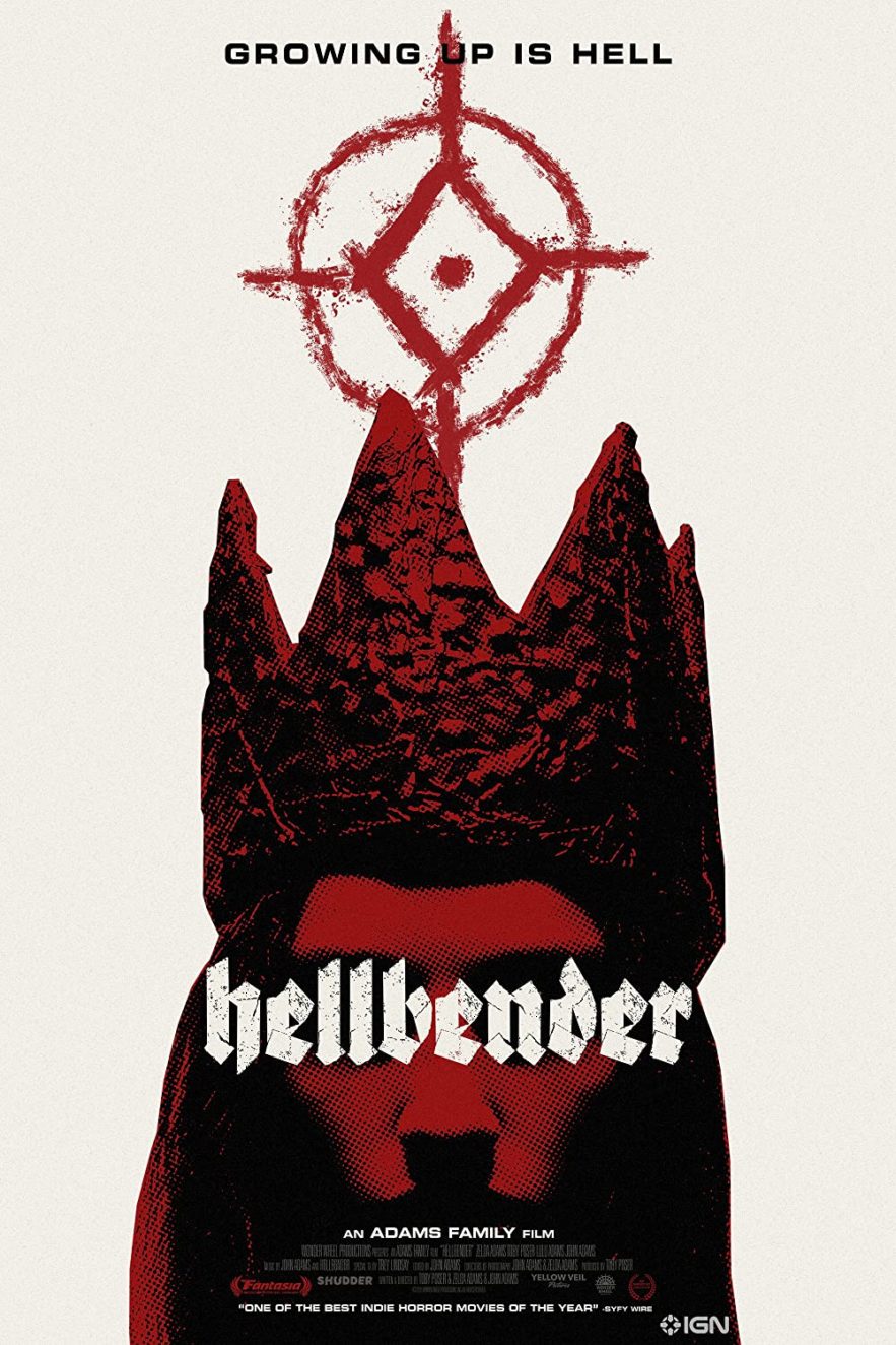
Not many horror posters make use of the color white, but this one uses it along with black and red contrasting accents to create an atmosphere of dread. This poster gives off a witchy vibe with a mysterious symbol hovering over a woman in a strange crown, inviting the viewer to wonder what they mean. The heavily contrasted face is lit in a creepy way, and the font alludes to metal music which also features in Hellbender.
The Runner
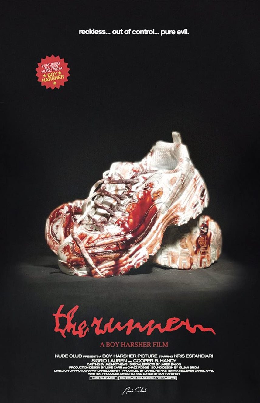
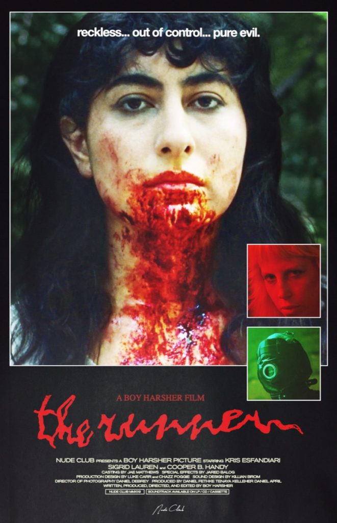
It’s not often you see a pair of shoes as the cover of a film, and these are pretty cool. Once again a very minimal poster, that’s asking a lot of questions. Where are these shoes from? Why are they covered in blood? Who is the runner and what circumstances led to them soiling their shoes so? The second poster for the visual album The Runner is also stylistically interesting, with both of them having an ‘80s vibe that is very present in the film itself.
Fresh
Fresh has a number of bangers for posters. The first one has some of the most interesting typography I’ve seen in a recent poster, and it flows well with the otherwise boring picture of the actors in the background. Similar to a lot of other posters on this list, the poster makes use of saturated color to draw the eye, in pink and red, hinting at the romantic plot. The next poster is a realistic hand in a packaged meat container, a vivid image and very relevant to the plot. The last poster is just a feast for the eyes, updating the myth of Adam and Eve.
All Jacked Up and Full of Worms
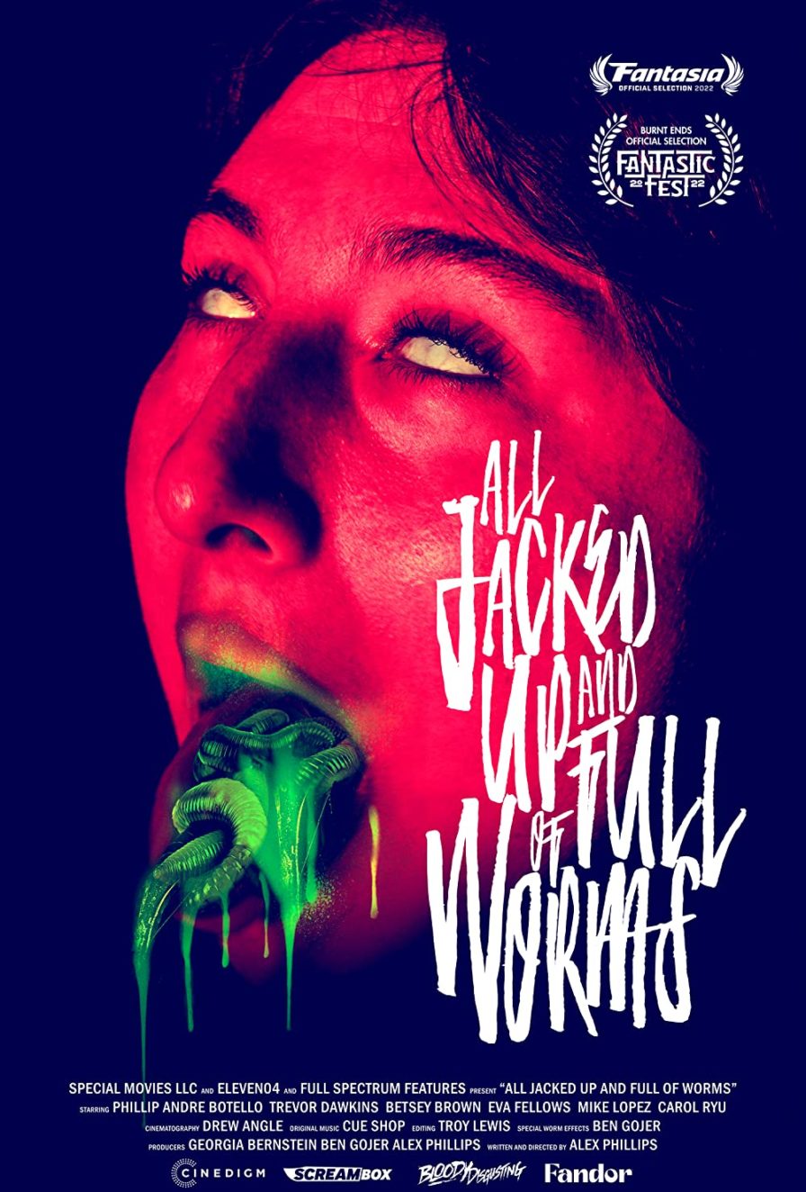
I look at this poster and I have questions. I haven’t had a chance to see this film yet but this poster makes it a priority. The poster tells me this movie is a crazy ride, with a font so stylized that it’s hard to read and intense colors highlighting a very intriguing concoction inside this woman’s mouth. Simple and effective!
The Creeping
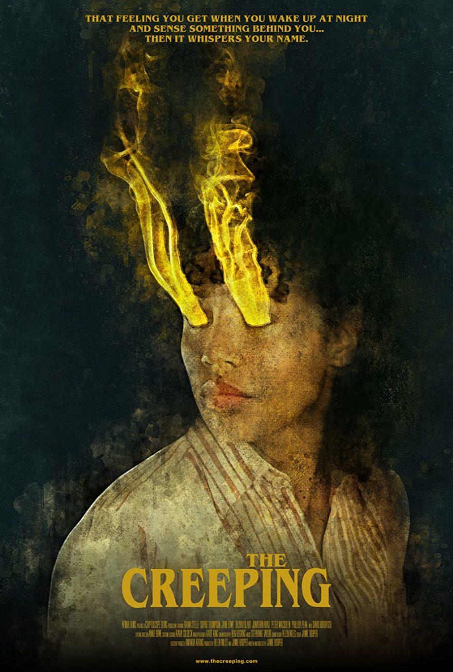
This poster really stands out to me, probably because of its yellow color choice which is not common on horror posters and its portrait painting style. I love the way the poster is designed to have the yellow smoke coming out of the eyes, done in a really aesthetically-pleasing way and also hinting that this movie may have to do with the paranormal. While the poster only features a woman doing nothing interesting in particular, her coming out of the darkness and being painted in an impressionistic style make this a memorable poster.
Mad Heidi
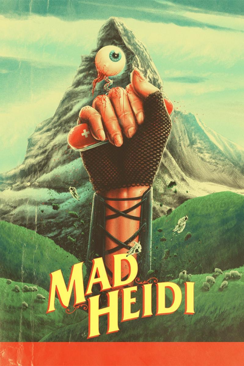
Mad Heidi is a horror exploitation interpretation of the Swiss book Heidi, and this poster plays on that to catch the eye of the viewer. At first, the poster might resemble a 1960s Swiss movie poster like The Sound of Music, but looking closer one would see that it’s not quite that type of movie. I love a good retro looking poster, and this one stands out from the sea of horror posters that are riffing on the ‘80s.
Nanny
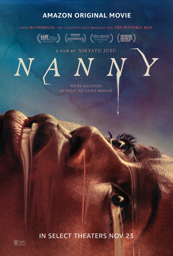
Nanny shows the gradual descent into despair for an immigrant mother taking up a stressful nannying job. This poster also makes use of a watercolor, impressionistic painting style that brings in some nice colors. The watercolor painting also leans into what looks like paint smudges coming from different areas of her face, which also double as water which is a theme in this film.
The Leech
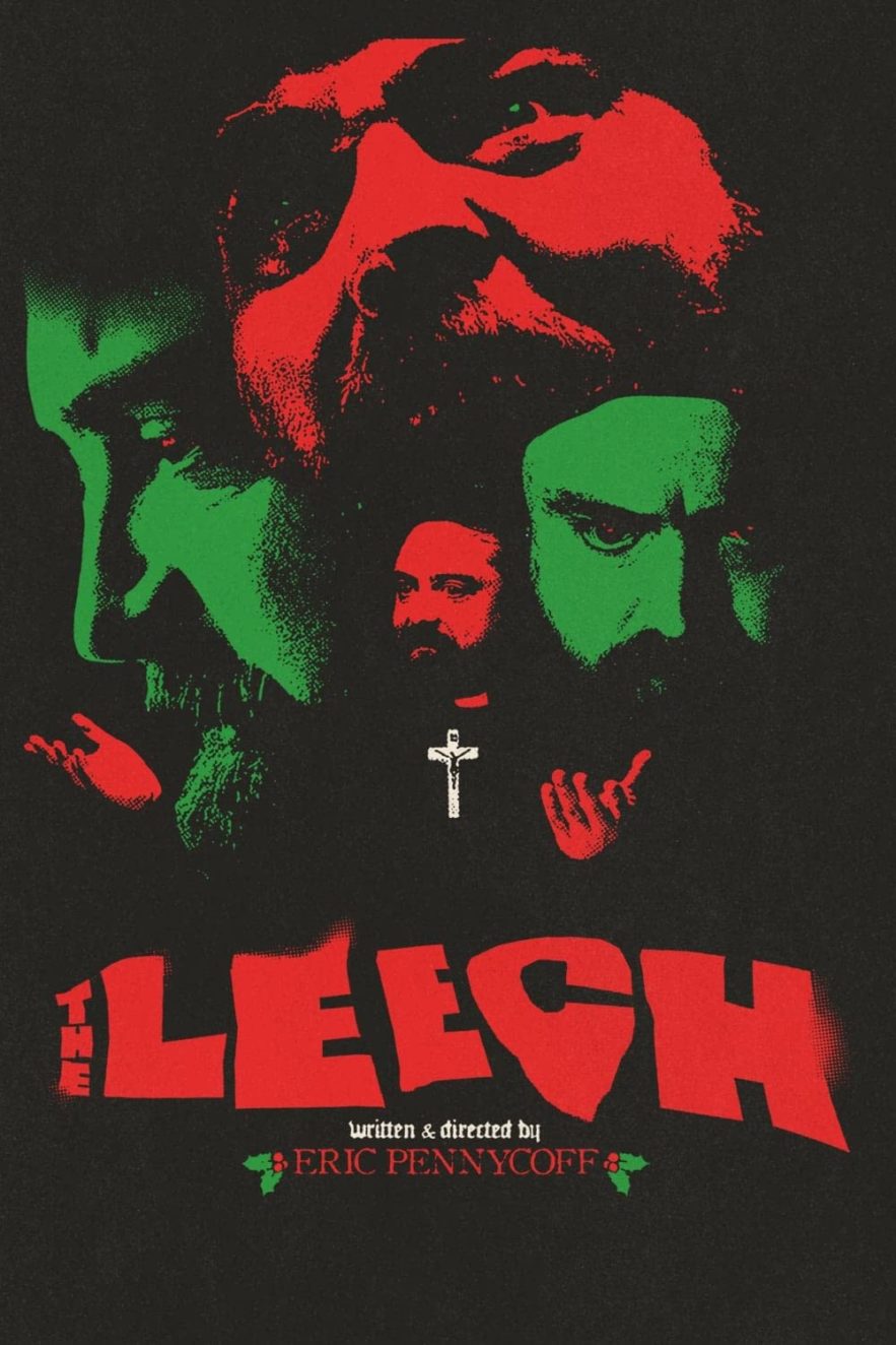
The poster for The Leech has one of the most subtle Christmas posters I’ve seen. Yes, it’s red and green, used charmingly, but it’s not hitting you over the head with Santa or other Christmas tropes like all the others. This poster comes off as a 1980s Giallo poster with colorful faces floating around in a distorted way. It also hints at Christianity being a big theme as the cross is the only non-red or green item in the poster. Lastly, that font is fantastic.
Hatching
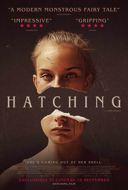
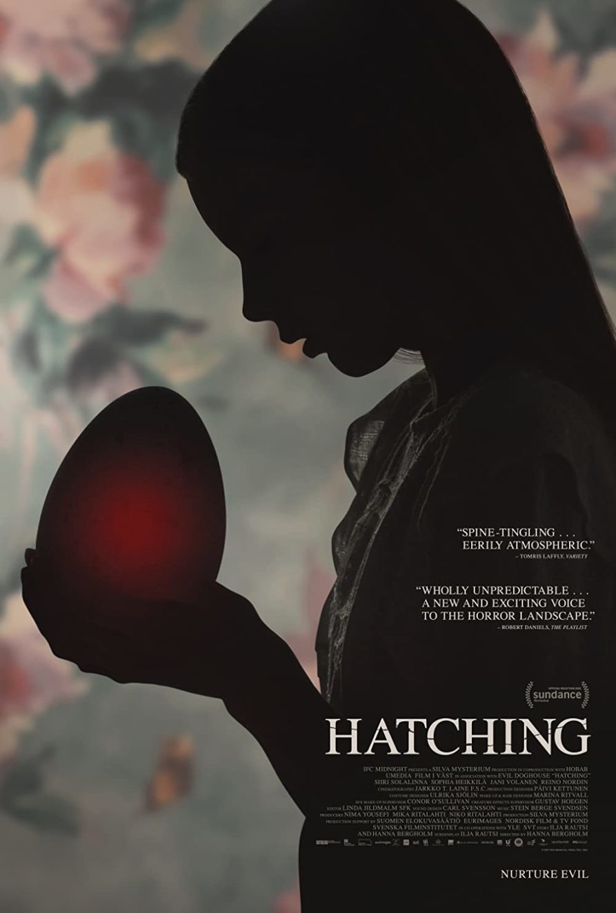
Hatching has an immediately striking poster from the first glance. It has a minimalist symmetry with the title centered between the two human halves, and that’s before you realize the crack is like an eggshell, motivated by the film’s unique premise involving a large egg. The second one also has the egg theme, but also uses shadows in a very interesting way and relies on the film’s magnificent wallpaper.
And those are my favorite horror film posters of 2022. There are many more notable posters that I could have included but these are the cream of the crop. Now, do the films stand up to their one sheets? Check out more 2022 posters I enjoyed here.


